Was this article helpful?
Thanks for your feedback
The Select field allows users to choose one or more options from a set of predefined choices. You can configure this field to be a Radio button, Checkbox, or Dropdown menu.
Additional Resource: To know about the difference between Reference & Select fields, read our documentation on Reference Vs. Select.
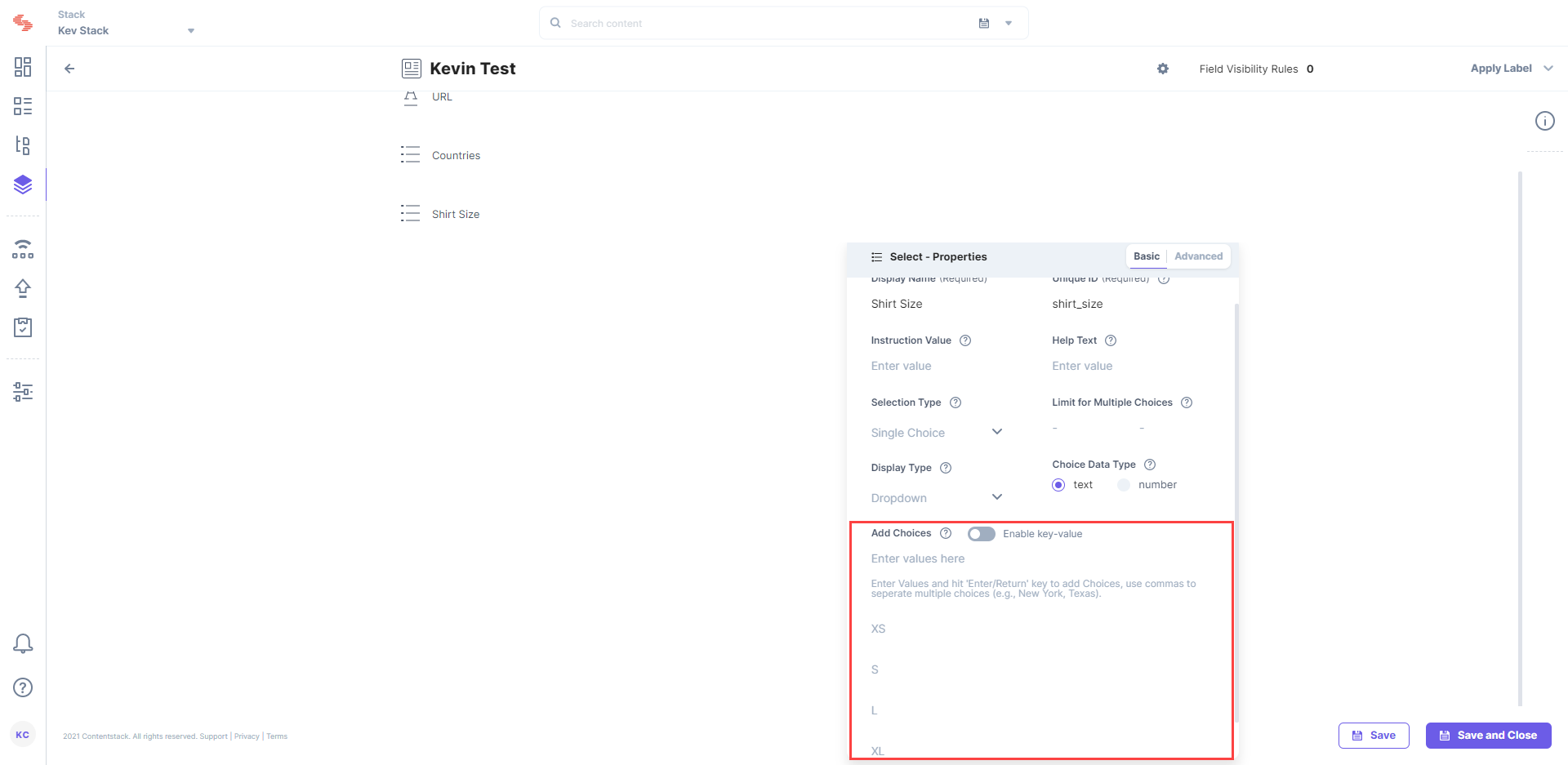
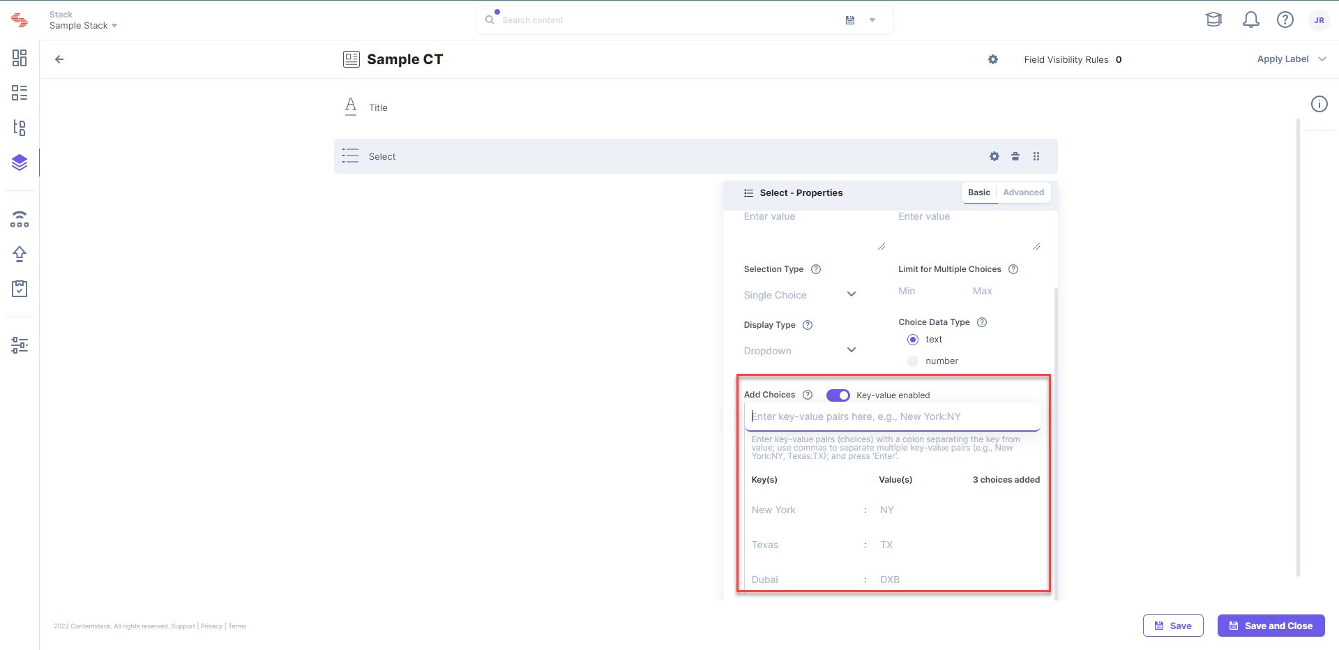
You can add choices within the Select field in two ways:

Note: Only the key name is displayed in the entry page, while the value is stored in the backend database for reference.
For example, we might want to specify the state code for a state while defining choices in a government website, so we can specify key-value pairs such as New York:NY.Note: A key and a value in a key-value pair option can contain a maximum of 100 characters

Warning: Enabling or disabling the Enable key-value button erases your existing choices. Proceed with caution to avoid any loss of data.
This field possesses certain properties that you can change any time as per your needs. The properties that can be modified are “Display Name,” “Unique ID,” “Instruction Value,” “Help Text,” “Mandatory,” “Non-localizable,” “Selection Type,” “Limit for Multiple Choices,” “Display Type,” “Choice Data Type,” and “Add Choices.”
Additional Resources: You can read more about Field properties in our detailed documentation page.
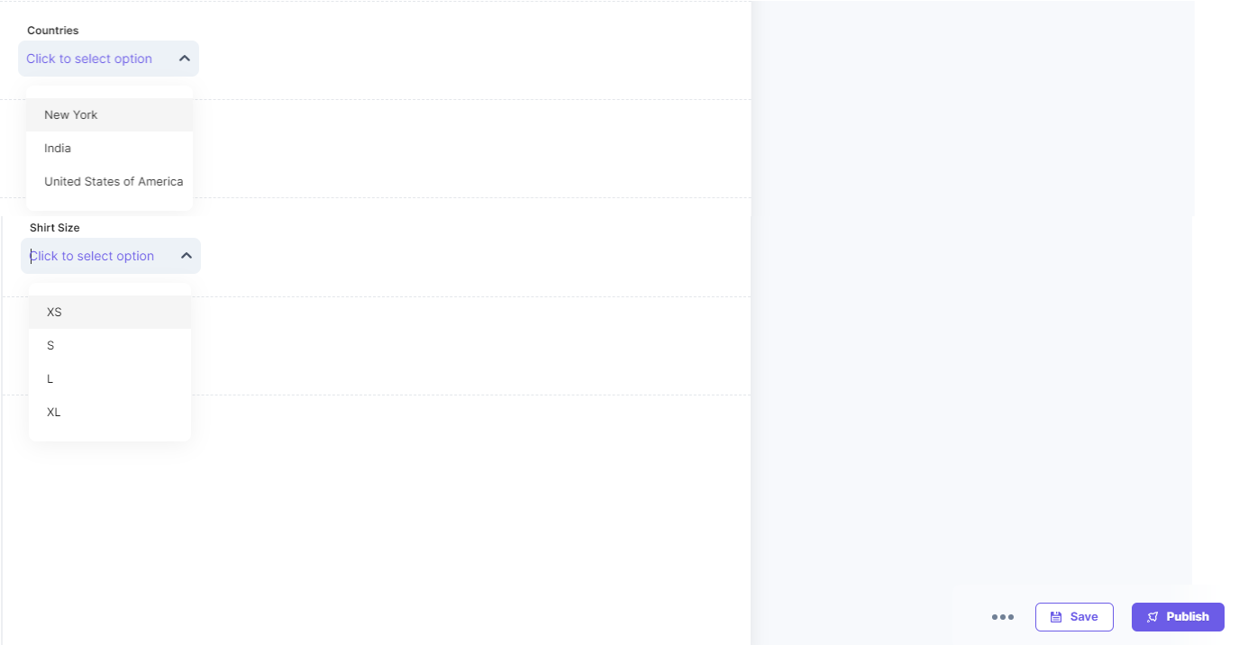
After you configure and add the Select field in the content type, you will see it on your entry page that shows Select field of Dropdown type as follows:

Note: In the select field, the maximum number of choices that you can add for a single dropdown menu is 100.
Additional Resource: Read more about Field Visibility Rules in our documentation where we have covered it extensively
Was this article helpful?
Thanks for your feedback