Was this article helpful?
Thanks for your feedback
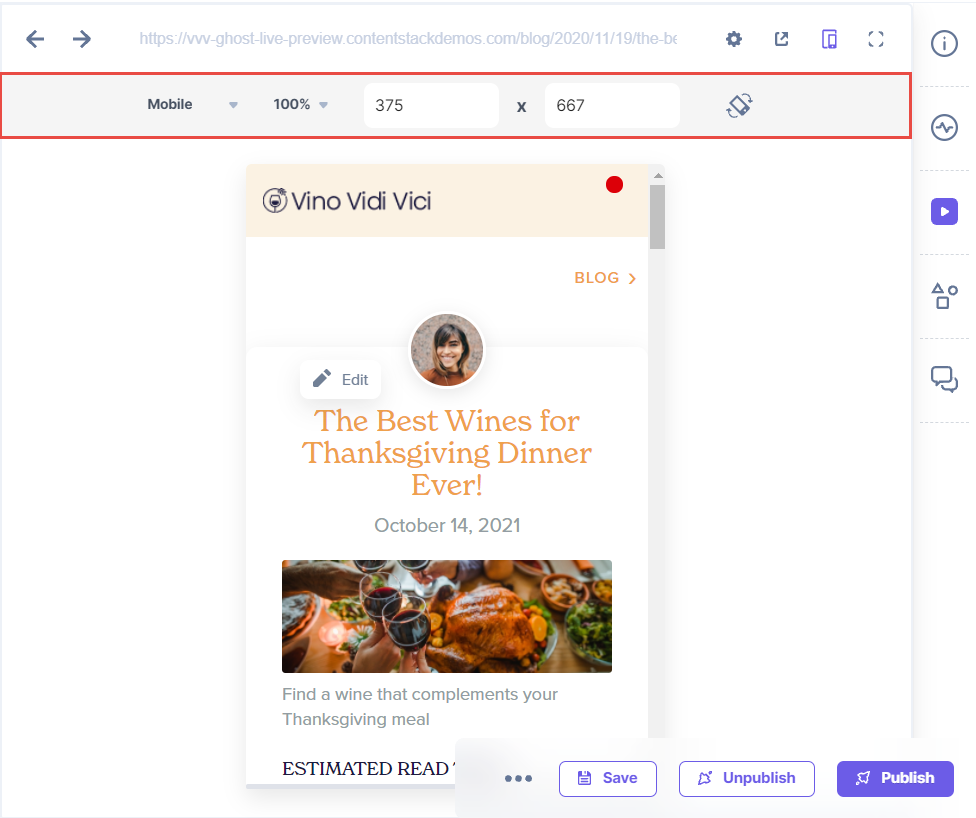
You can preview content across various digital platforms: Desktop, Mobile and Tablet. Selecting any one of these options automatically sets the preview pane to the width of the specified digital platform.

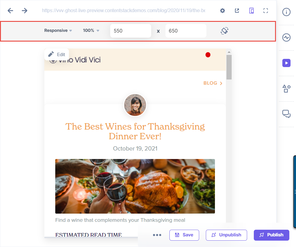
You can also check the responsiveness of your site by adjusting the aspect ratio as you need.

Note: You cannot edit the aspect ratio defined for Mobile and Tablet devices in the preview window.
Was this article helpful?
Thanks for your feedback