Omnichannel Content Preview Experience

Digital engagements usually happen across various platforms. As a content manager, you would like to know how the content would be visible to visitors on your website, mobile application, as well as desktop application. Thus, you must prepare to present a user experience that resembles the requirements of your target viewers.

With the Live Preview feature, content managers can seamlessly preview content across multiple channels, such as mobiles, tablets, and desktops, resulting in a truly omnichannel experience.

This omnichannel strategy helps relate to seamless user experience across the various platforms to which your brand delivers its content.

To get the most out of the omnichannel experience, follow the steps given below:
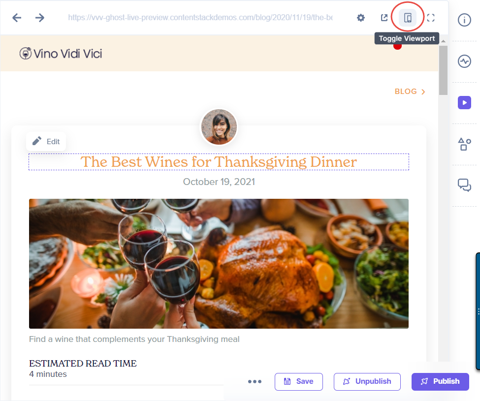
  1. Open an entry in your stack.
  2. Click on the Live Preview icon in the right-hand side panel of the entry editor page.
  3. In the upper right corner, click on the “Toggle Viewport” button to access the different preview modes available for your webpage.
    Toggle_Viewport_Button.png
  4. From the channel dropdown, you can use any one of the following options to preview your content:
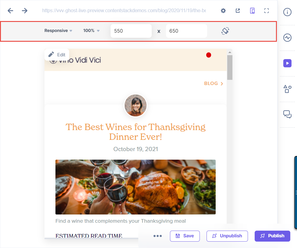
    1. Responsive Mode:
      Using this mode, you can change the aspect ratio of your webpage. This will immediately change the dimensions of your preview window, thus, allowing you to view the responsiveness of your webpage.
      Responsive_preview_mode.png
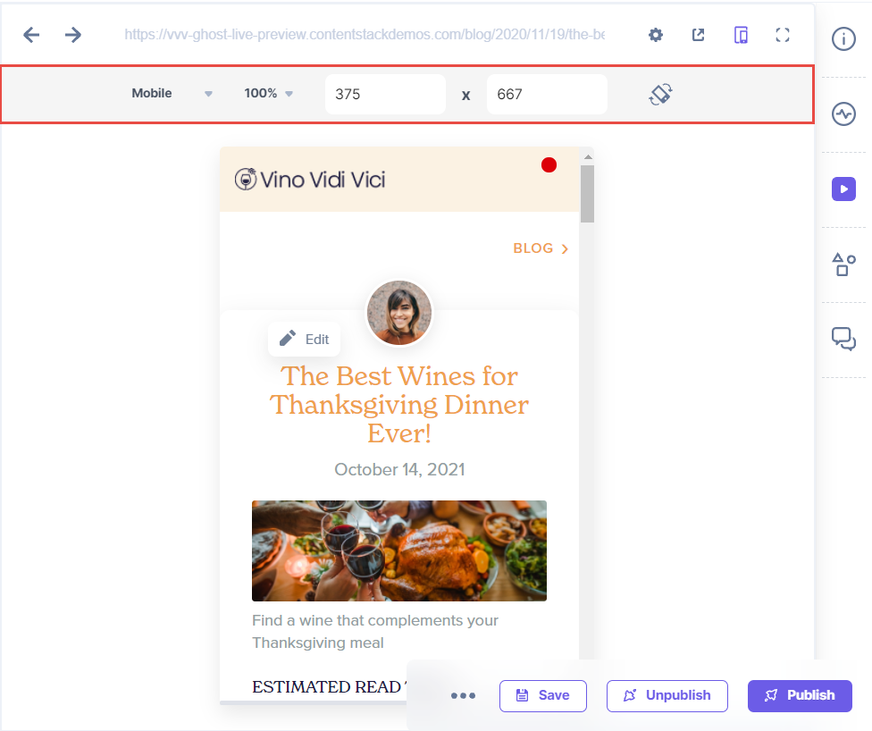
    2. Mobile Mode:
      This mode sets a specific aspect ratio that is seen in mobile devices, allowing you to preview the responsiveness of your webpage on a mobile device.
      Preview_Content_on_Multiple_Devices.png
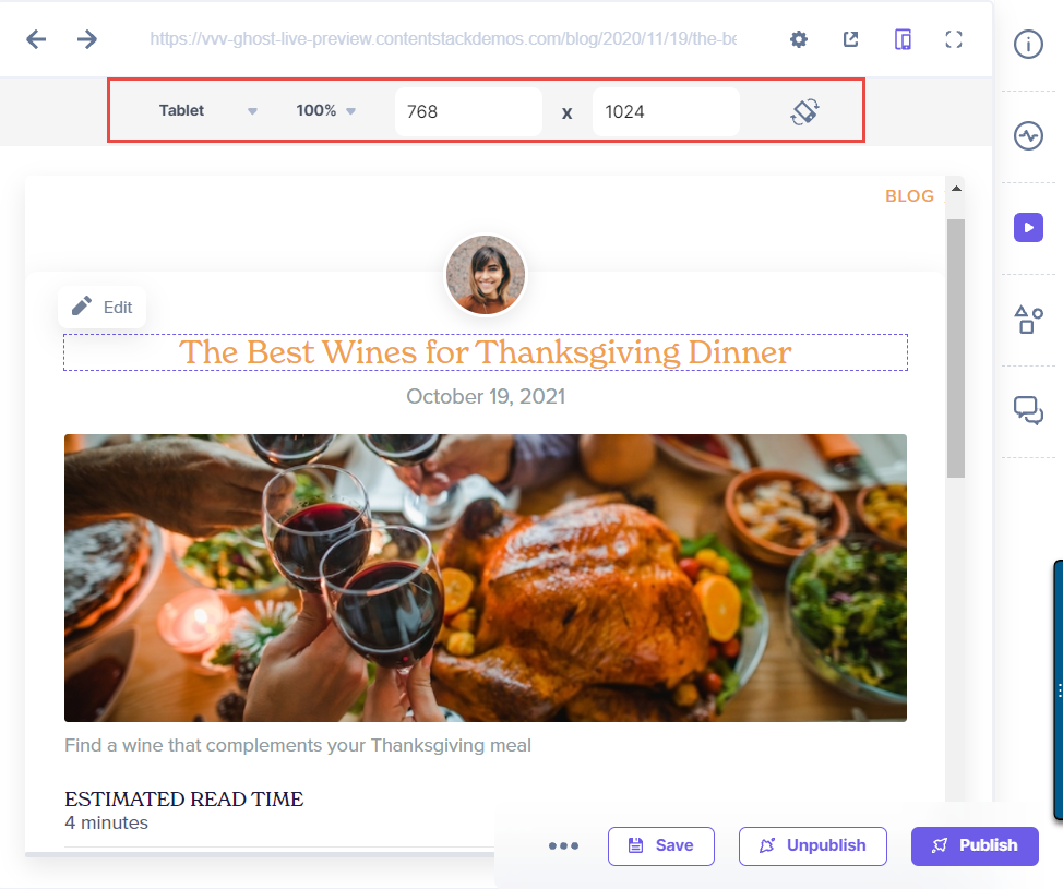
    3. Tablet Mode:
      Using the Tablet mode, you can preview the responsiveness of your webpage on a tablet device.
      Tablet_Preview_Mode.png
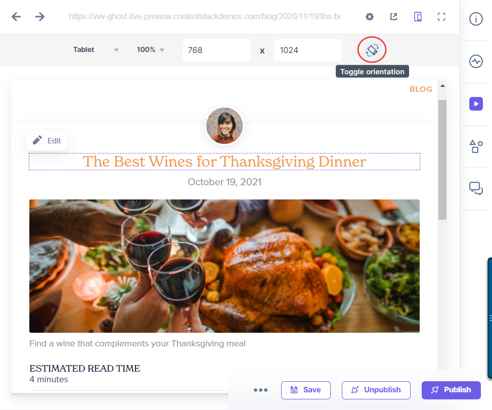
  5. You can also change the orientation of your webpage by clicking on the Toggle orientation button. This setting interchanges the width and height dimension values assigned to your preview window to form a different view.
    Toggle_Orientation_Button.png

Note: You cannot edit the aspect ratio defined for Mobile and Tablet devices in the preview window.

Was this article helpful?

Thanks for your feedbackSmile-icon

On This Page

^