Was this article helpful?
Thanks for your feedback
In this section, we will learn how to build a simple “Color Picker” application using the Contentstack app framework. This will enable a custom field UI location in the stack, which provides a native color picker polyfill that Contentstack users can use as an input field within a content type.
This step-by-step guide explains how to create a Color Picker custom field app for your content types.
Note: This guide is written assuming you are using boilerplates or a project with a similar structure.
Note: You need to run these commands inside the /ui directory.
$ npm install
$ npm run dev
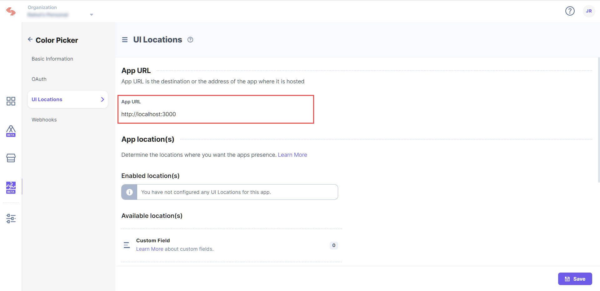
This hosts your application on http://localhost:3000. We can now use this URL to register the application.
To register your app with Contentstack, log in to your Contentstack account and follow the steps given below:
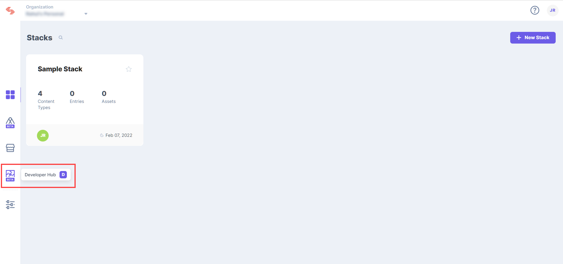
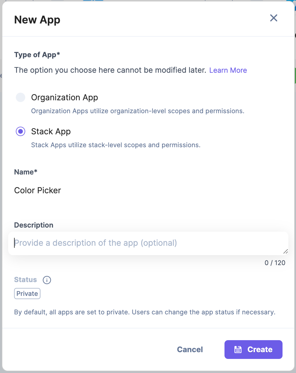
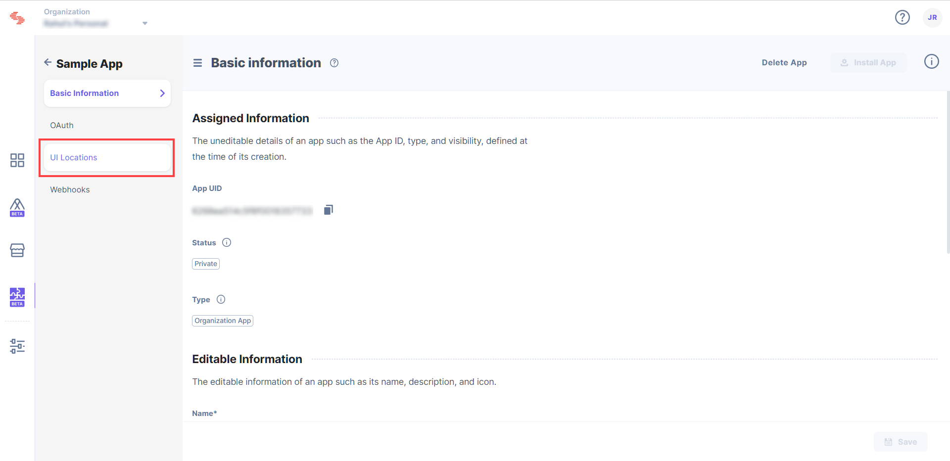
In the configure UI locations section, you can add and configure UI locations for your application. Since we are creating a color picker custom field, we’ll add and configure the custom field UI location.
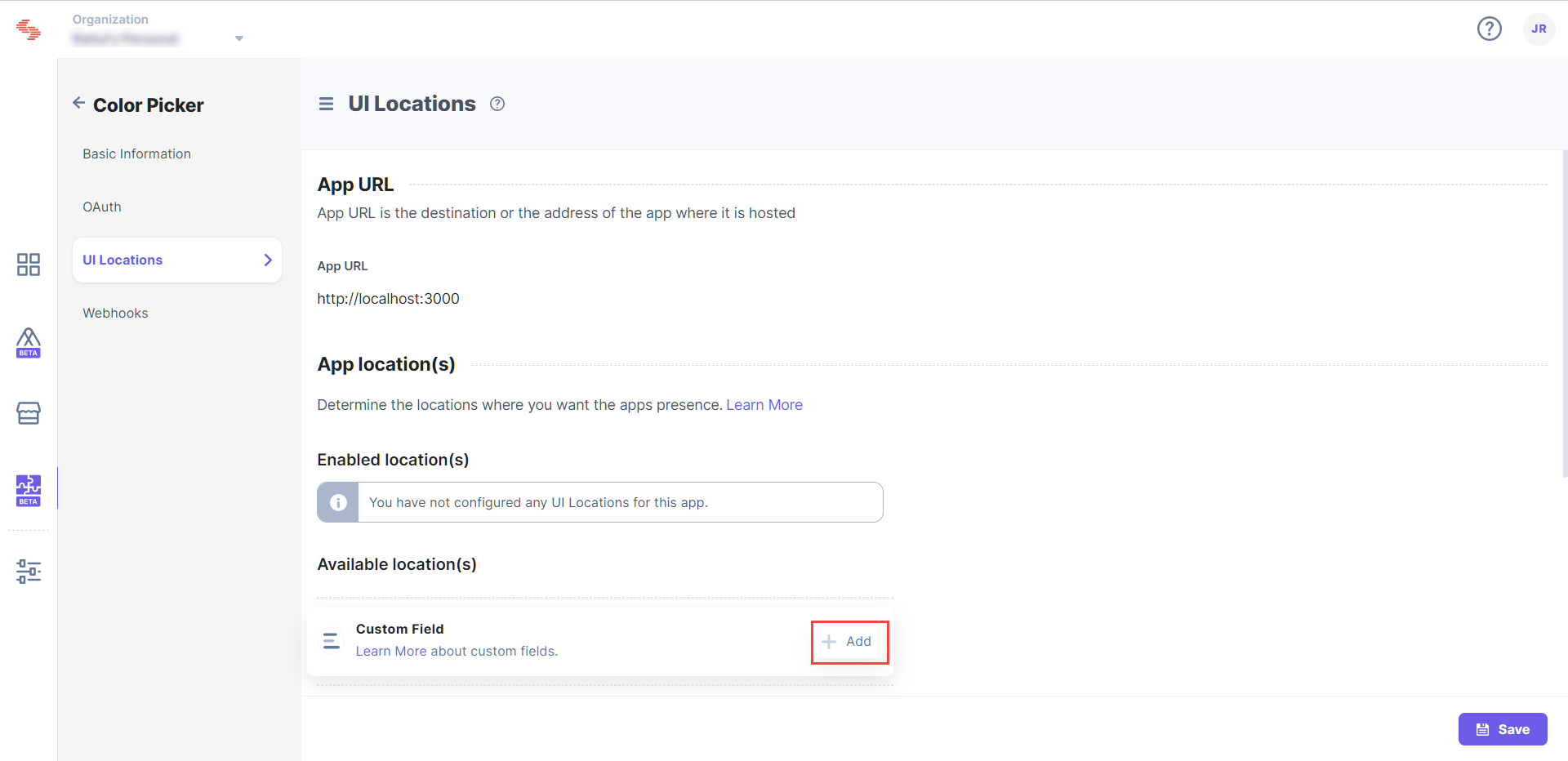
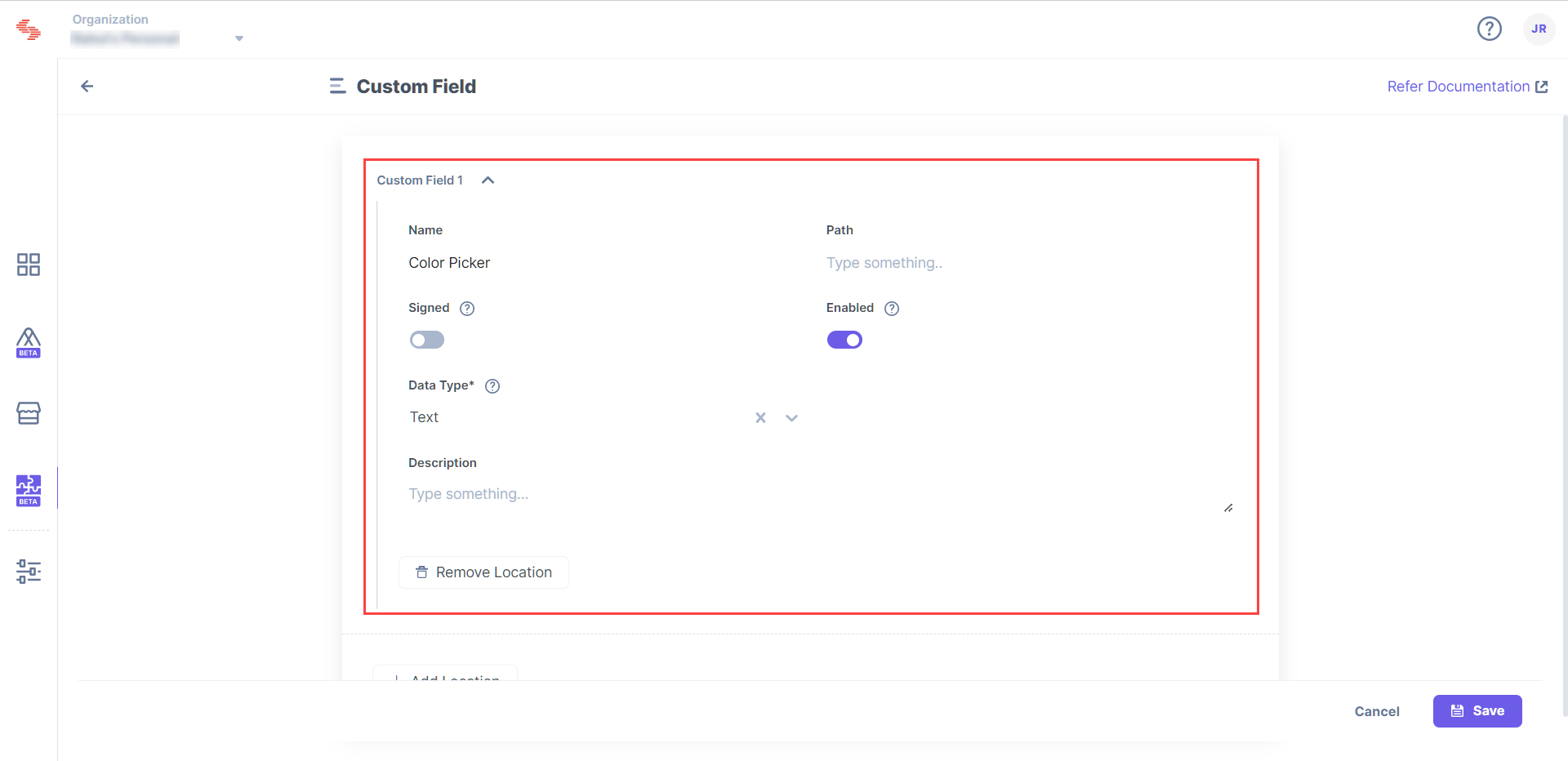
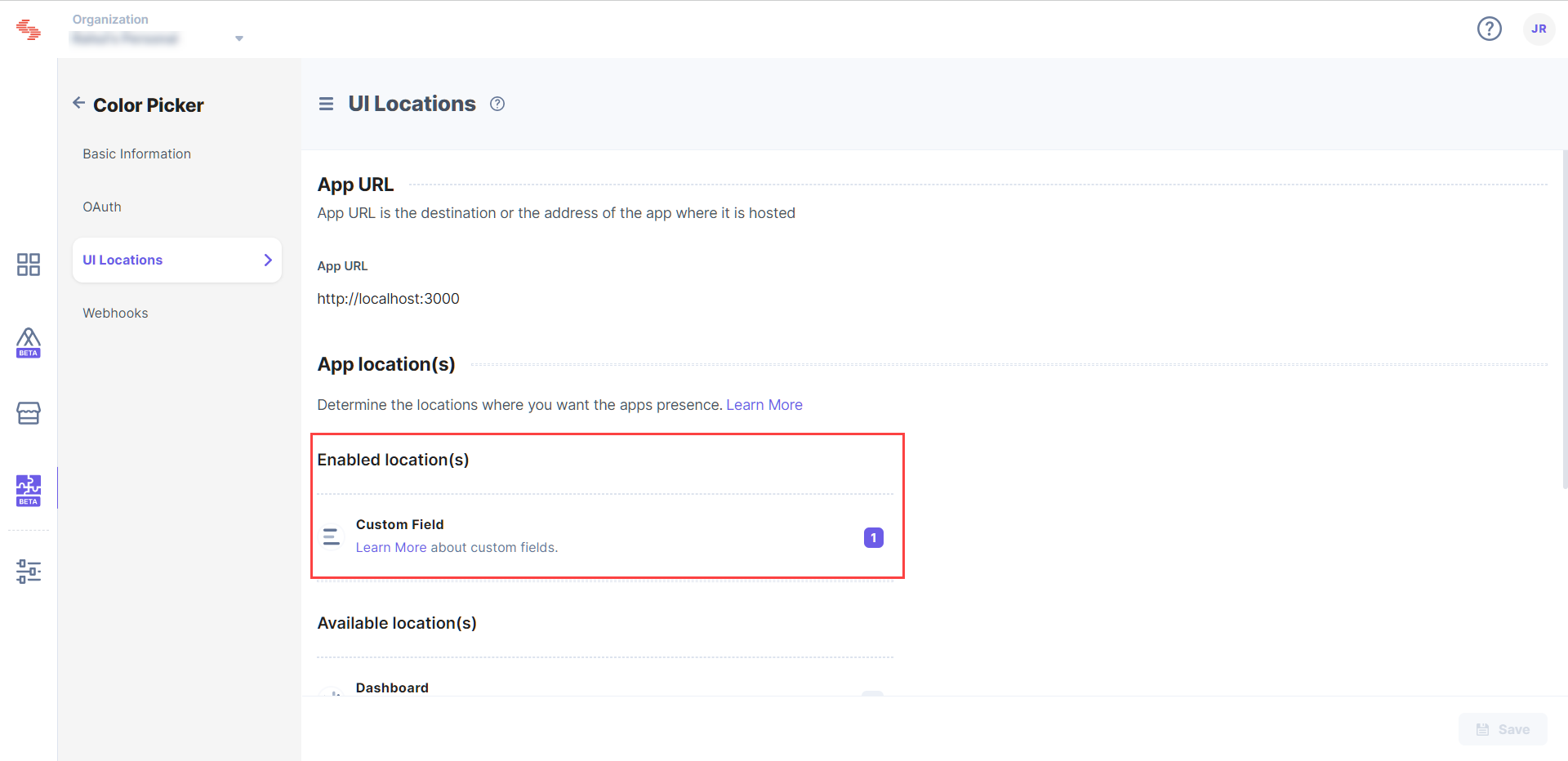
Now that you have configured your custom field location, you need to install the app. Installing the app will make it available in the specific stack you select.
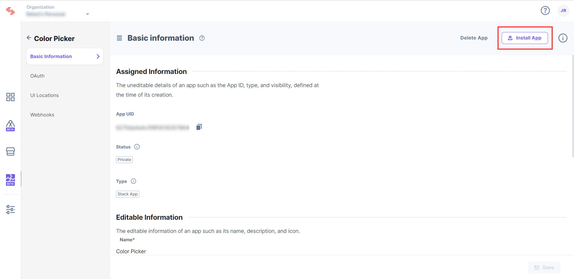
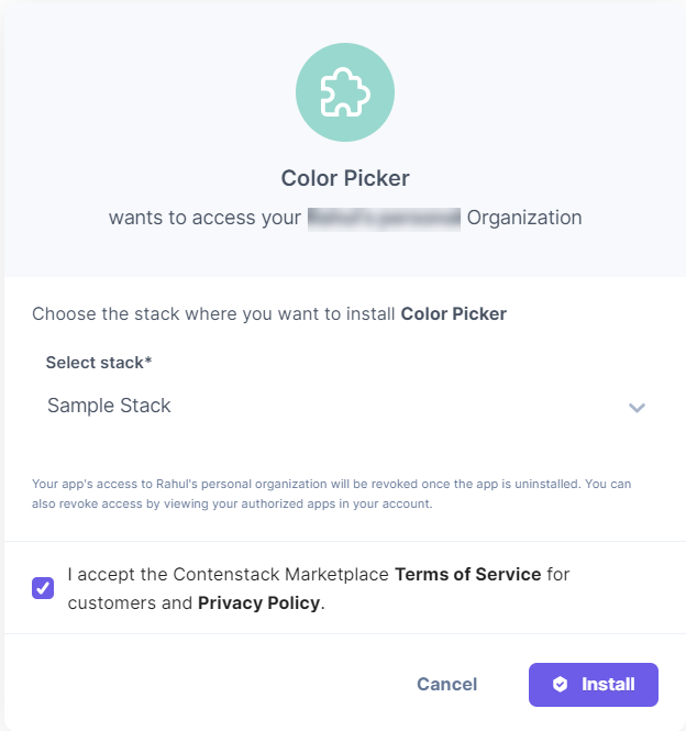
Your Color Picker app is now installed within your stack, but to use it, you need to add it within your content type. Open the stack in which you have installed the Color Picker app and follow the steps given below:
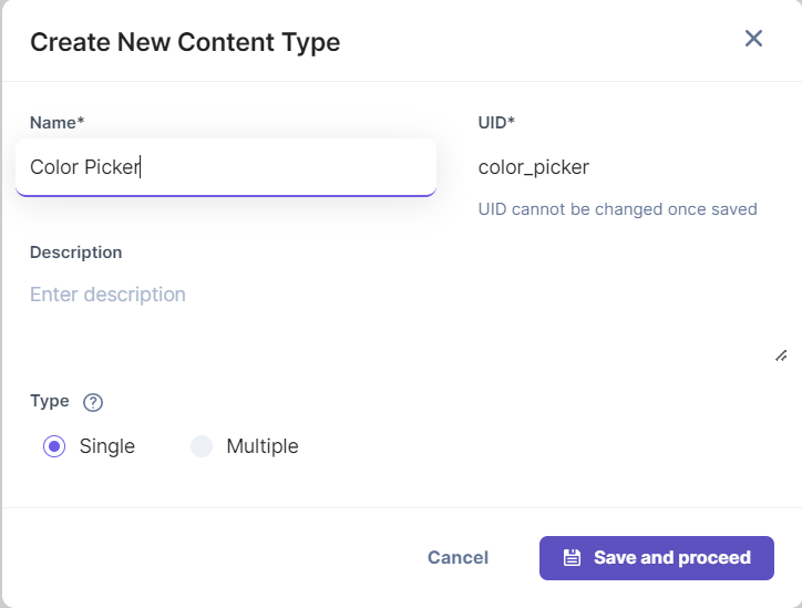
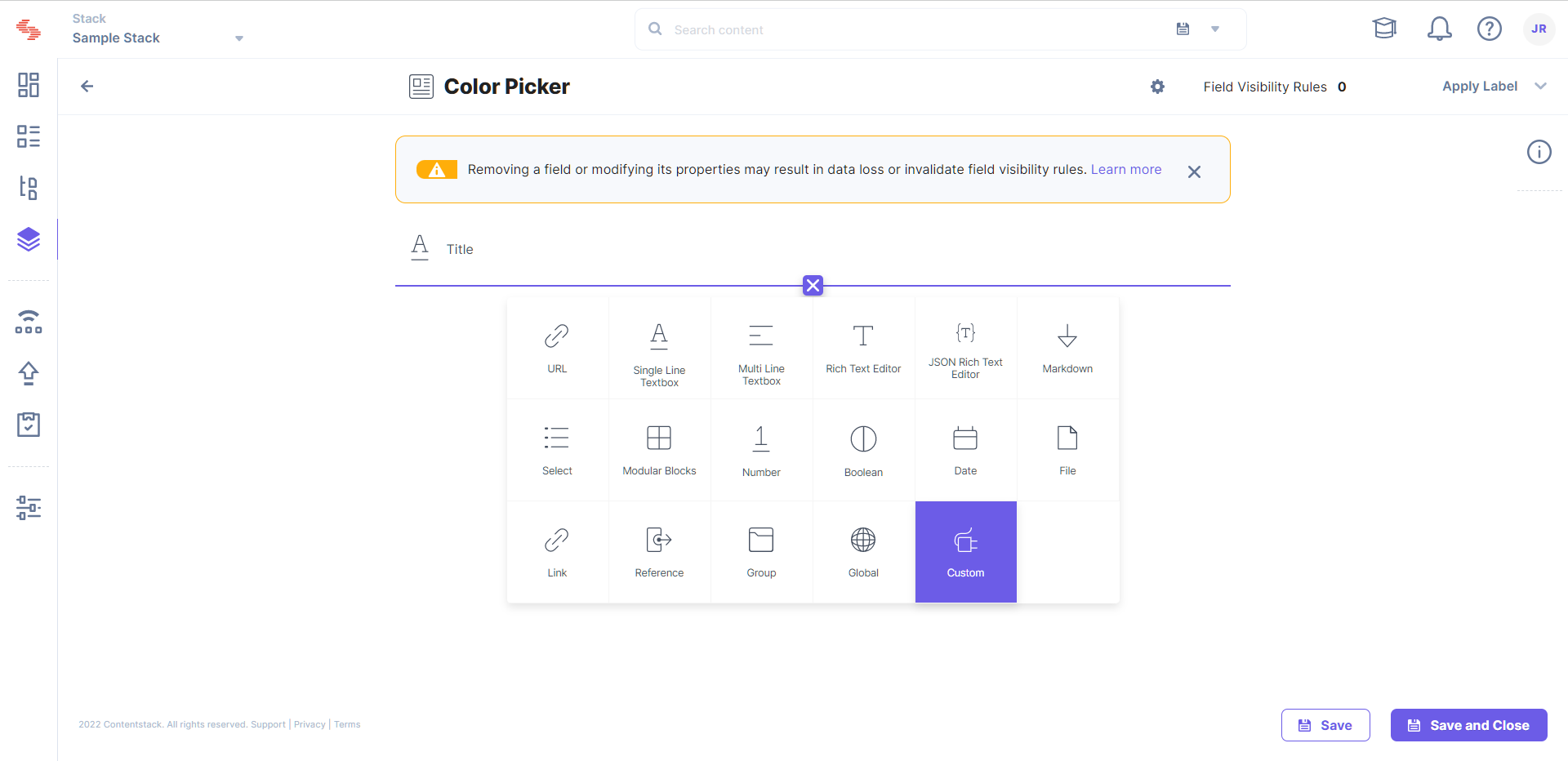
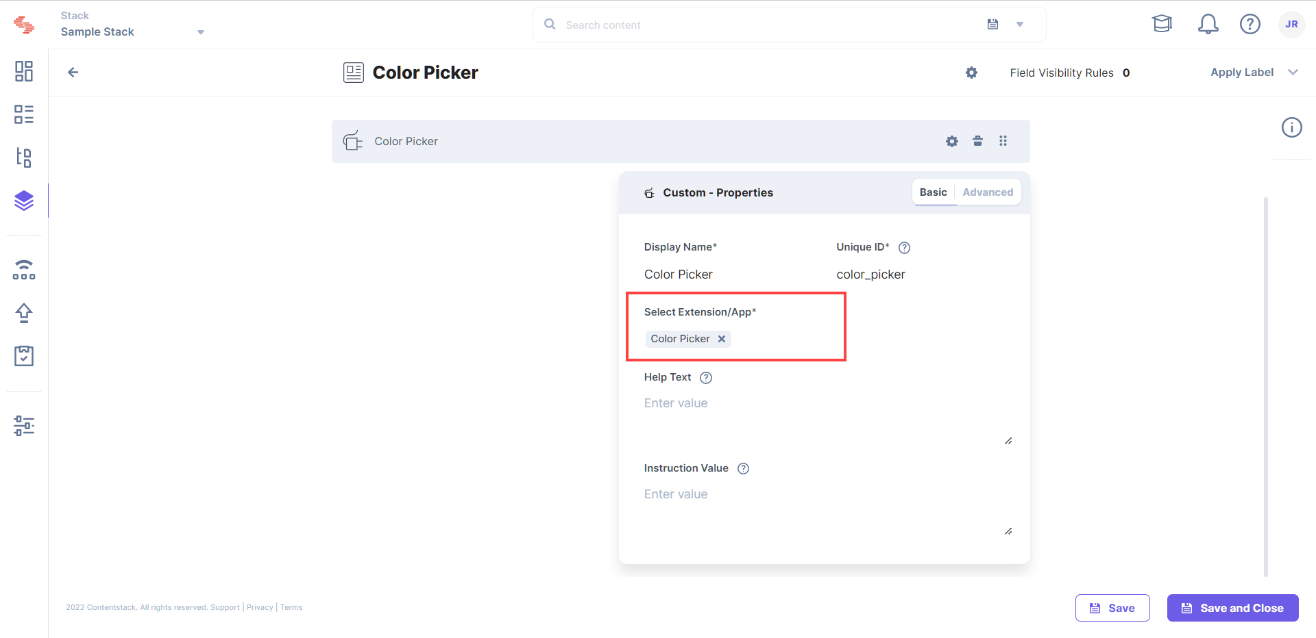
To use the Color Picker app, create an entry for this content type, and you will see the this field on your entry page as shown below:
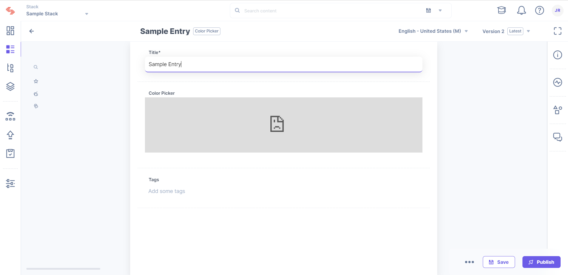
At this point, the code does not show the color picker app and should just show an error message. Now let's add the actual color picker code to the app.
Now that you have installed the Color Picker app, you need to add the color picker code and update the boilerplate code to suit your application.
export interface ColorPickerData {
    showPicker: boolean;
    pickerColor: {
        r: any;
        g: any;
        b: any;
        a: any;
    };
}/* Import React modules */
import React, { useEffect, useState } from "react";
import { SketchPicker } from "react-color";
import reactCSS from "reactcss";
/* Import other node modules */
import { InstructionText } from "@contentstack/venus-components";
import ContentstackAppSdk from "@contentstack/app-sdk";
/* Import our modules */
import localeTexts from "../../common/locale/en-us";
import { TypeSDKData, ColorPickerData } from "../../common/types";
/* Import node module CSS */
/* Import our CSS */
import "./styles.scss";
const CustomField: React.FC = function () {
const [state, setState] = useState<TypeSDKData>({
config: {},
location: {},
appSdkInitialized: false,
});
const [stateColor, setColor] = useState<ColorPickerData>({
showPicker: false,
pickerColor: {
r: "108",
g: "92",
b: "231",
a: "100",
},
});
const styles = reactCSS({
default: {
color: {
width: "70px",
height: "30px",
borderRadius: "4px",
background: `rgba(${stateColor.pickerColor.r}, ${stateColor.pickerColor.g}, ${stateColor.pickerColor.b}, ${stateColor.pickerColor.a})`,
},
},
});
const togglePickerVisibility = () => {
setColor((prev) => ({
showPicker: !prev.showPicker,
pickerColor: prev.pickerColor,
}));
};
const closePicker = () => {
setColor((prev) => ({
showPicker: false,
pickerColor: prev.pickerColor,
}));
};
const pickerColorChanged = (colour: any) => {
setColor((prev) => ({
showPicker: prev.showPicker,
pickerColor: colour.rgb,
}));
state.location?.CustomField?.field?.setData(colour);
};
useEffect(() => {
ContentstackAppSdk.init().then(async (appSdk) => {
const config = await appSdk?.getConfig();
setState({
config,
location: appSdk.location,
appSdkInitialized: true,
});
appSdk.location.CustomField?.frame?.updateHeight?.(300);
const initialData = appSdk.location?.CustomField?.field?.getData();
if (initialData?.rgb) {
setColor({
showPicker: false,
pickerColor: initialData.rgb,
});
}
});
}, []);
return (
<div className="layout-container">
{state.appSdkInitialized && (
<div>
<InstructionText testId="color-picker-text">
{localeTexts.customField.instruction}
</InstructionText>
<div>
<div className="swatch" role="none" onClick={togglePickerVisibility} onKeyDown={togglePickerVisibility}>
<div style={styles.color} />
</div>
{stateColor.showPicker ? (
<div className="popover">
<div className="cover" role="presentation" onClick={closePicker} onKeyDown={closePicker}>
<SketchPicker color={stateColor.pickerColor} onChange={pickerColorChanged}/>
</div>
</div>
) : null}
</div>
</div>
)}
</div>
);
};
export default CustomField;
.config-wrapper {
    .Form__item {
        width: 500px;
    }
    .tippy-wrapper {
        margin-right: 10px;
    }

    .radio-wrapper {
        padding: 20px 10px;
    }

    .radio-button {
        margin-right: 20px;
    }

    .toggle-save-response {
        padding: 20px 10px;
    }
 }

.swatch {
    padding: 5px;
    background: #fff;
    border-radius: 1px;
} instruction: "Pick a Color",
$ npm install reactcss react-color
$ npm i --save-dev @types/react-color
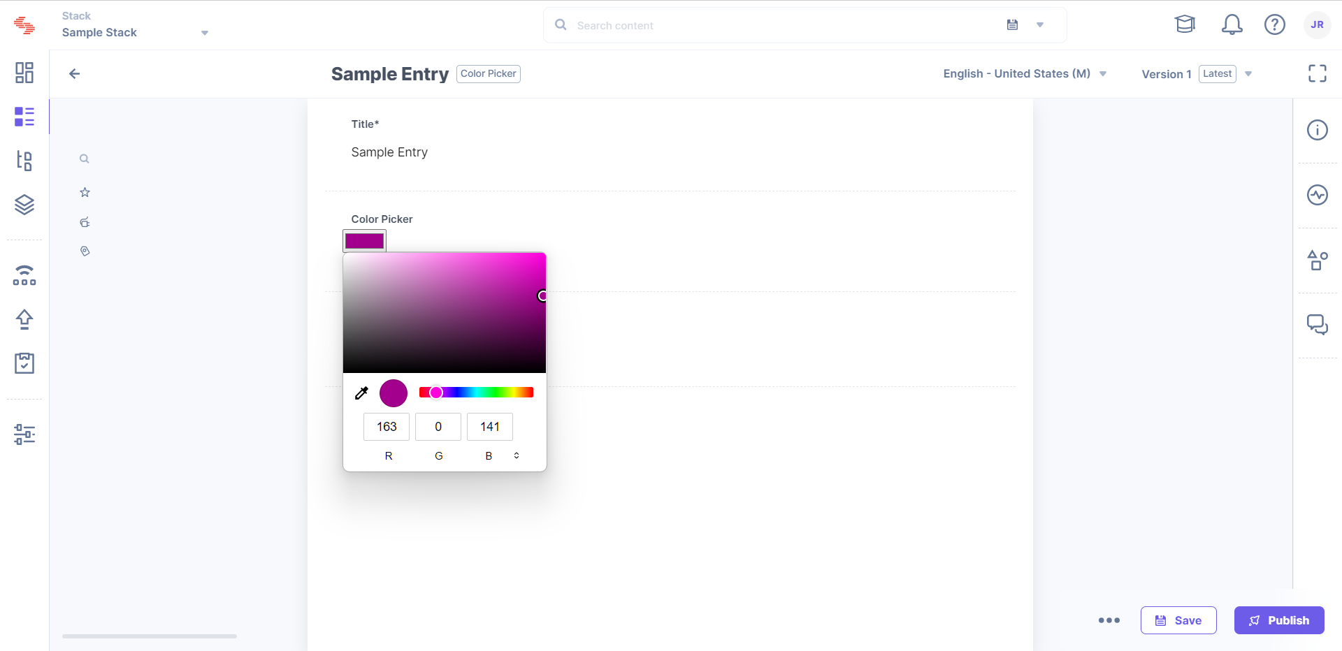
$ npm run dev
Was this article helpful?
Thanks for your feedback