Was this article helpful?
Thanks for your feedback
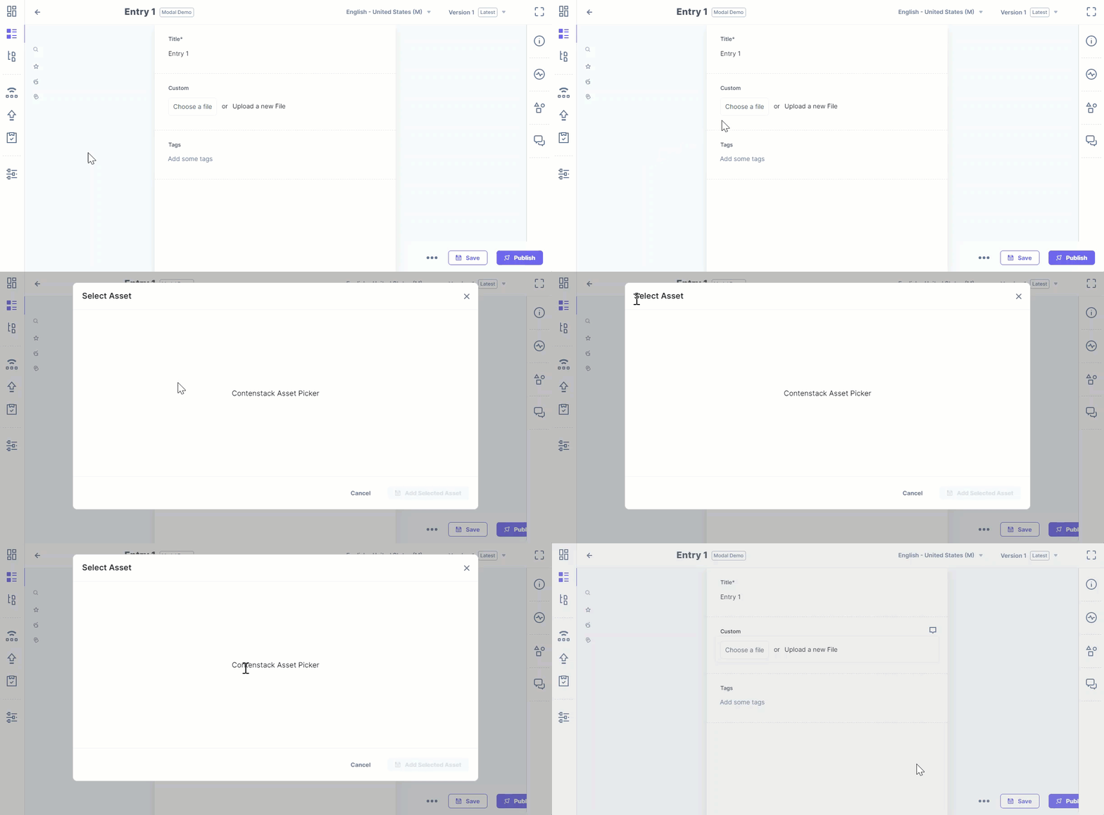
When working with extensions, mainly custom fields, there are a few situations where we might need to open some pop-ups or modals. You can use "window.open" to launch a new browser window to address these use cases. Although the use case is handled by this method, the modal that is opened is not all-inclusive. You can use the "venus-components" to open a modal within apps and extensions to display additional information, collect additional inputs from users, or draw attention to a specific feature (or features) on a page, etc.
Following are the prerequisites and steps to create and add a modal for apps/extension.
The Contentstack Venus Component Library best works with React version >= 16.8.0
Required Packages:
import "@contentstack/venus-components/build/main.css";
window.iframeRef = document.getElementById('root');window.postRobot = sdk.postRobot
When everything is set up, the 'cbModal' component from '@contentstack/venus-components' may be used to open the modal.
import { useEffect, useRef } from "react";
import ContentstackAppSDK from "@contentstack/app-sdk";
import { Button, cbModal } from "@contentstack/venus-components";
import "@contentstack/venus-components/build/main.css";

import SelectModal from "./components/SelectAsset";

function App() {
 const ref = useRef(null);
 useEffect(() => {
   ContentstackAppSDK.init().then((sdk) => {
     // The snapshot of referenced DOM Element will render in-place of custom field when modal is opened
     const iframeWrapperRef = ref.current
     // or
     // const iframeWrapperRef = document.getElementById('root')
     window.iframeRef = iframeWrapperRef;

     window.postRobot = sdk.postRobot
     sdk.location.CustomField.frame.updateHeight(55)
   })
 }, []);

 const handleClick = (e) => {
   cbModal({
     component: (props) => (<><SelectModal {...props} /></>),
     modalProps: {
       size: "max"
     }
   })
 }

 return (
   <div ref={ref} className="extension-wrapper">
     <div className="btn-wrapper">
       <button buttontype="tertiary-outline" onclick="{handleClick}">
         Choose a file
       </Button>
       <span classname="{'text'}">
         or
       </span>
       <span onclick="{()" ==""> { }}
         className={'upload-btn'}
       >
         Upload a new File
       </span>
     </div>
   </div>
 );
}

export default App;
import React from 'react'
import { ModalFooter, ModalBody, ModalHeader, ButtonGroup, Button } from "@contentstack/venus-components"


const EditModal = (props) => {
   return (
       <>
           <ModalHeader title={"Select Asset"} closeModal={props.closeModal} />
           <ModalBody className="modalBodyCustomClass">
               <div className='dummy-body'>
                   Contenstack Asset Picker
               </div>
           </ModalBody>
           <ModalFooter>
               <ButtonGroup>
                   <Button onClick={props.closeModal} buttonType="light">
                       Cancel
                   </Button>
                   <Button onClick={props.closeModal} icon="SaveWhite" data-testid="save-button" disabled>
                       Add Selected Asset
                   </Button>
               </ButtonGroup>
           </ModalFooter>
       </>
   )
}

export default EditModal

Additional Resource: For a comprehensive collection of Contentstack’s UI components which can be used to build UI Extensions and Contentstack-based applications, please refer to the Contentstack Venus Component Library and the App SDK documentation.
Was this article helpful?
Thanks for your feedback