We have introduced a couple of validation properties for the “File” field and one validation for the “Date” field, including:
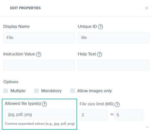
1. “Allowed file type(s)” for the “File” field
The “Allowed file type(s)” property lets you specify the types of files that the user will be allowed to upload. This helps you restrict users from uploading files that are not required or acceptable. A case in point is a registration form, where the user is required to upload photos in JPEG or PNG formats only or identity proof in PDF format.

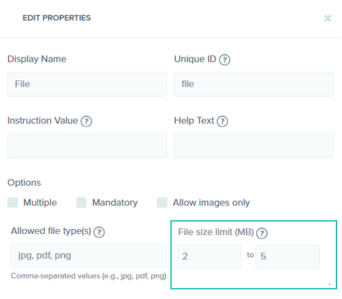
2. “File size limit” for the “File” field
The “File size limit” property lets you specify limitations on the size of the file that can be uploaded by the user. You can set maximum as well as minimum limit for the size of the file to be uploaded.

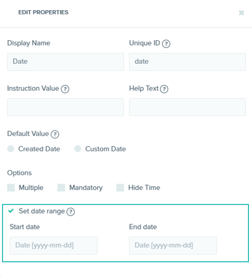
3. “Set date range” for the “Date” field
The “Set date range” property lets you specify a range of dates from which the user will be allowed to select a date. You can set a start date and an end date of the range. This will restrict the user from selecting any date outside of the specified range. An example would be a date field in an event registration form, where the event is for a week or a month. By setting a date range, you can ensure that the attendee is allowed to select a date only from the specified date range.

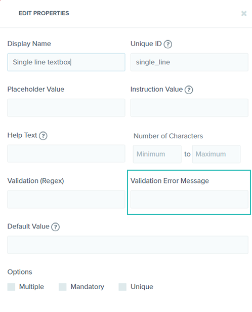
Custom Validation Error Message Support
You can now add custom error messages for failed validations set for the fields of your content type. This can be done by using the Validation Error Message property, which we have introduced in this release. This property is available for single-line as well as multi-line text box fields. For instance, if you have set a validation for checking if the value entered is an email address, you can set a custom error message like “Please enter a valid email address,” which will be displayed if the user fails to do so.

