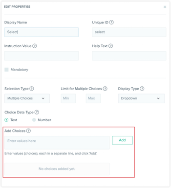
In this week’s release, we introduced the Select field, which allows users to choose one or more options from a set of predefined choices. This makes it easier for your content editors to create check boxes, drop-downs and radio buttons.
"Selection Type" Offers You Single or Multiple Choices
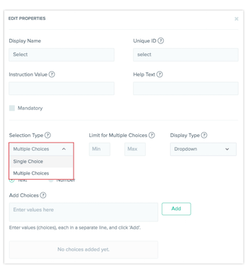
Now you can control whether your users can pick a single or multiple values from a list by setting "Selection Type" to "Single" or "Multiple." In addition to that, you can set a minimum or maximum number of options allowable from a "Multiple" selection type.
Choose How You Want to Display Your Multiple Choices with "Display Type"
Pick the best experience for your users between drop-down, radio, or check boxes.
Here are ways in which you can present your selections:
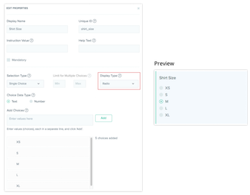
View as Radio buttons
Use this when you have a short list of options and users should only pick one such as ‘Gender’ or ‘Age Group’. This option is available only if the ‘Selection Type’ is set to ‘Multiple’.
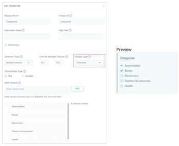
View as Check boxes
This option is best if you have a small list of options and you want to let users choose more than one. It is only available for multiple choice selection type.
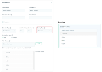
View as a Drop-down menu
The drop-down option lets users select either a "Single" or "Multiple" choices. It's your best option for when there's lots of choices for users to pick from. A great example would be a "Location" field (if you have over 10 locations for a user to choose from).
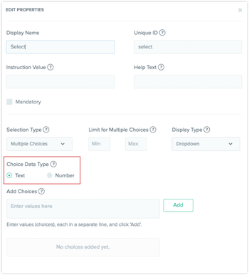
Specify the Type of Data You Want for Each Field
You can set the data type you want, in text or by numerical value, under "Choice Data Type." This is helpful for your automation when you integrate this with your app or website.
Add a List of Values for Your Select Field
Finally, under "Add Choices," add the choices your content editors can pick from. You can add choices one by one, or add several choices by separating them with a new line. You can always edit, delete, or re-order them whenever you want.

