Week One: AR Framework & User Research, Marker Tracking, Content Modeling, and Interaction Design
The team at Valtech is building a Contentstack-powered Augmented Reality proof of concept in 4 weeks.
If you’re just joining us, you can find a summary of week zero (how we got this far) here. Today we’re covering week one, the goal of which was to define everything needed to accomplish the POC.
The concept so far: We are building an application that will take some complex information from a beauty / skincare product and make it easier to understand through augmented reality and personalization.
Experience & Interaction Design
Before any development work could begin, our concept had to be translated into isolated problem statements which could then be made into tasks to fill out our three one-week sprints. This meant it was time for another brainstorming session.
What experience are we creating?
The team spent 3 hours on Zoom and in their Miro board with the goal of hammering out the following:
- What problem are we solving for customers?
- What specifically are we going to demonstrate in our POC?
- What data are we going to display?
- What is the interaction model?
1. What problem are we solving for customers? What task do we want our users to be able to accomplish? What are the user needs?
For many at Valtech, this step was a rapid onboarding into the world of skincare. First, the team took a look at some major skincare retailers to get an idea of the basic taxonomy of skincare products: What do they call things, and how do they classify them?
They also did some user research: a quick internal Google Forms survey that aimed to identify what the biggest skincare questions, concerns, and needs were among real people who might use this kind of app.
Based on these two research questions, the team found the following: there is very little variation in the way products are categorized (cleansers, exfoliators, moisturizers, etc., came up over and over again as product category descriptors), and people are generally overwhelmed with the amount of undifferentiated information thrown at them by skincare products and brands.
In other words, though you might know you need a cleanser, moisturizer, and sunscreen, that still doesn’t tell you which one works best for you; whether the ingredients will help or harm you personally, or interact poorly with each other; or even how much of each to use, when, and in what order. So there was definitely an unmet information simplification need here. Check.
2. What specifically are we going to demonstrate in our POC? What products are we going to work with for scanning & information display?
Here, the Valtech team pulled in some beauty & skincare subject matter experts that they found within the company. They identified the different steps that go into a skincare routine:
- Cleanser - to clean the skin
- Toner - an astringent to shrink the pores and change pH
- Serum - which nobody could explain, beyond “something magical with vitamins”
- Moisturizer - to prevent the skin from drying out
- Sunblock - to protect from the damaging effects of the sun
BIG INSIGHT #1. PEOPLE ARE ESPECIALLY CONFUSED ABOUT A PARTICULAR CATEGORY OF SKINCARE PRODUCTS.
Based on this, the team decided that for the purposes of this demo, the specific example they would zero in on would be helping people to navigate selecting and using a serum, since this is the product that they could find the least clarity on (and therefore, could reasonably surmise that the information needs for this product would be immediately obvious to the biggest number of people).
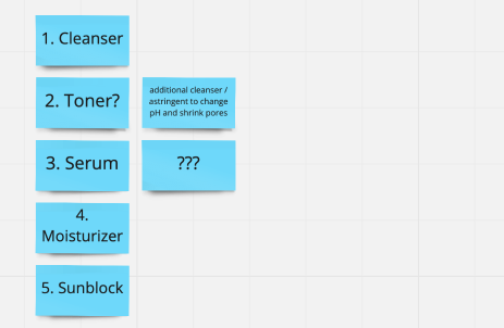
What on earth is a serum?
3. What data are we going to display?
At the root of this next question is one that the team assures me they keep coming back to over and over again: How are we actually going to make this useful?
Explains Jason, “if people are just looking at words, then it’s essentially just a website brochure. We want users to be able to interact with this in a way that can help them accomplish the tasks they need to accomplish.”
In the case of figuring out what to do with a serum, the team identified the following information needs that could arise for our POC:
- Concentration of serum — do I need 5% or 2% “active ingredient” (eg. Vitamin C)?
- Usage recommendations — how do I use it, and where does it fit into my routine (in which order, how many times per week)?
- Product recommendations — what are other products that go along with this serum (e.g. the next step in the suggested skincare regimen?)
4. What is the interaction model? How does the user interface with the system?
Looking at the usage story so far, the team mapped out the following:
Someone wants to buy a serum from a particular brand. They want to know which product is recommended for them (based on — for this POC — a pre-existing “profile” with preferences, current routine, etc. already known), how to use it, and whether at some point the products they are using need to change in any way (e.g. concentration, increase sunblock or moisturizer, etc.) This is when the team hit on…
BIG INSIGHT #2. THIS SERVICE WILL BE THE MOST USEFUL IF WE STICK TO ONE PRODUCT OVER TIME.
Up until this point, the idea had been to make an app that helps to choose between products in-store, and have it offer several kinds of interactions depending on what kind of help you were looking for.
But the results of the research and brainstorming showed that with skincare, there isn’t necessarily a need to constantly keep shopping for new ones. Consumers have a desire to select a product that is guaranteed to do what they want to accomplish at that point in time (e.g. reduce wrinkles, moisturize dry skin, protect from the sun) and then understand exactly how to make that happen once they take it home. The questions don’t stop once you leave the store with the product in-hand. There is still a lot to understand about making this product most effective for me, in my routine, right now.
So, the team decided to build 3 interaction scenarios that would show just that — personalization of information about one skincare product over time.
What exactly will we build?
Interaction Scenarios
I didn’t know what interaction design was, so I asked Svante Nilson, Senior Designer.
It’s basically: How we want users of the application to consume the AR content we are producing, as well as designing the look and feel of that content.
Or in other words: What's that AR experience going to look like and feel like? What's going to show up on your phone, what's going to display around the product? How's it going to display? How are you going to interact with that? And why would people want to use this? (There’s that #1 question again.)
And then repeating that over the different kinds of interactions: in the store and at home.
Sketching comps
The team zeroed in on three scenarios that they wanted to build out, and Svante got to work on designing them as pencil sketches. He would then run these past the engineers to determine feasibility, and adjust as needed, until they arrived at interactions that seemed easy, useful, and possible to build quickly.
Scenario I: At the store
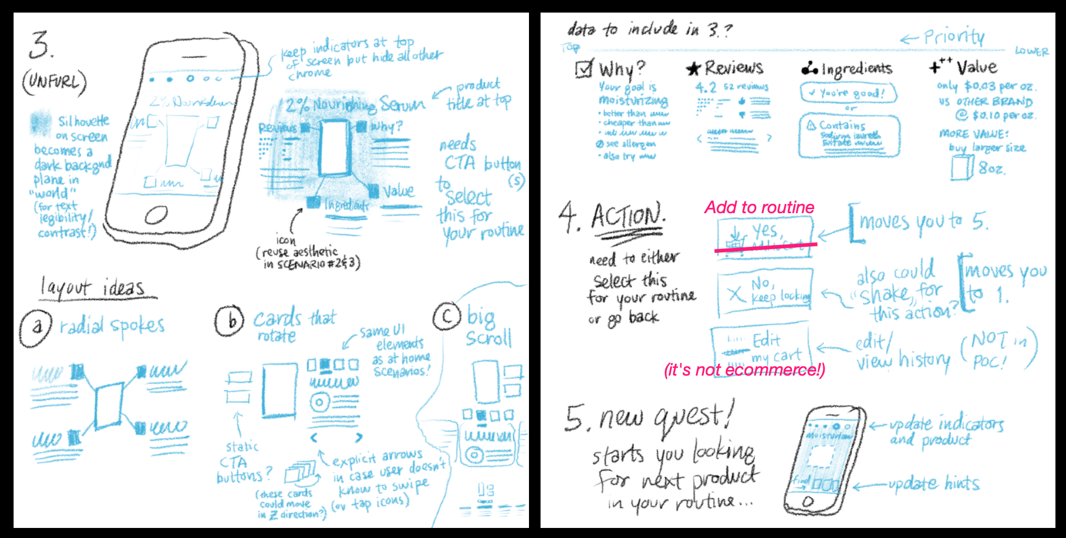
Differentiate between multiple bottles on a shelf. AR information here can include things like reviews, cost and affordability, ingredients from the perspective of allergic reactions or sustainability, and any other things that might make the product stand out to you to make you want to purchase it.
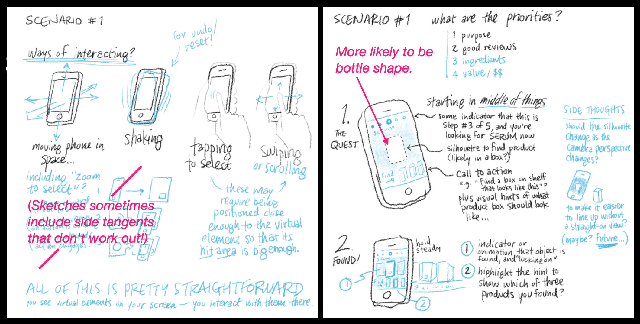
In this scenario, you are scanning the shelf with your phone. You are not holding any products in your hands, so you are able to tap and interact with the augmented reality information laid out around the product using your free hand. This is what you can see being worked out in the sketch below.
Scenario II: At home, first time using the product
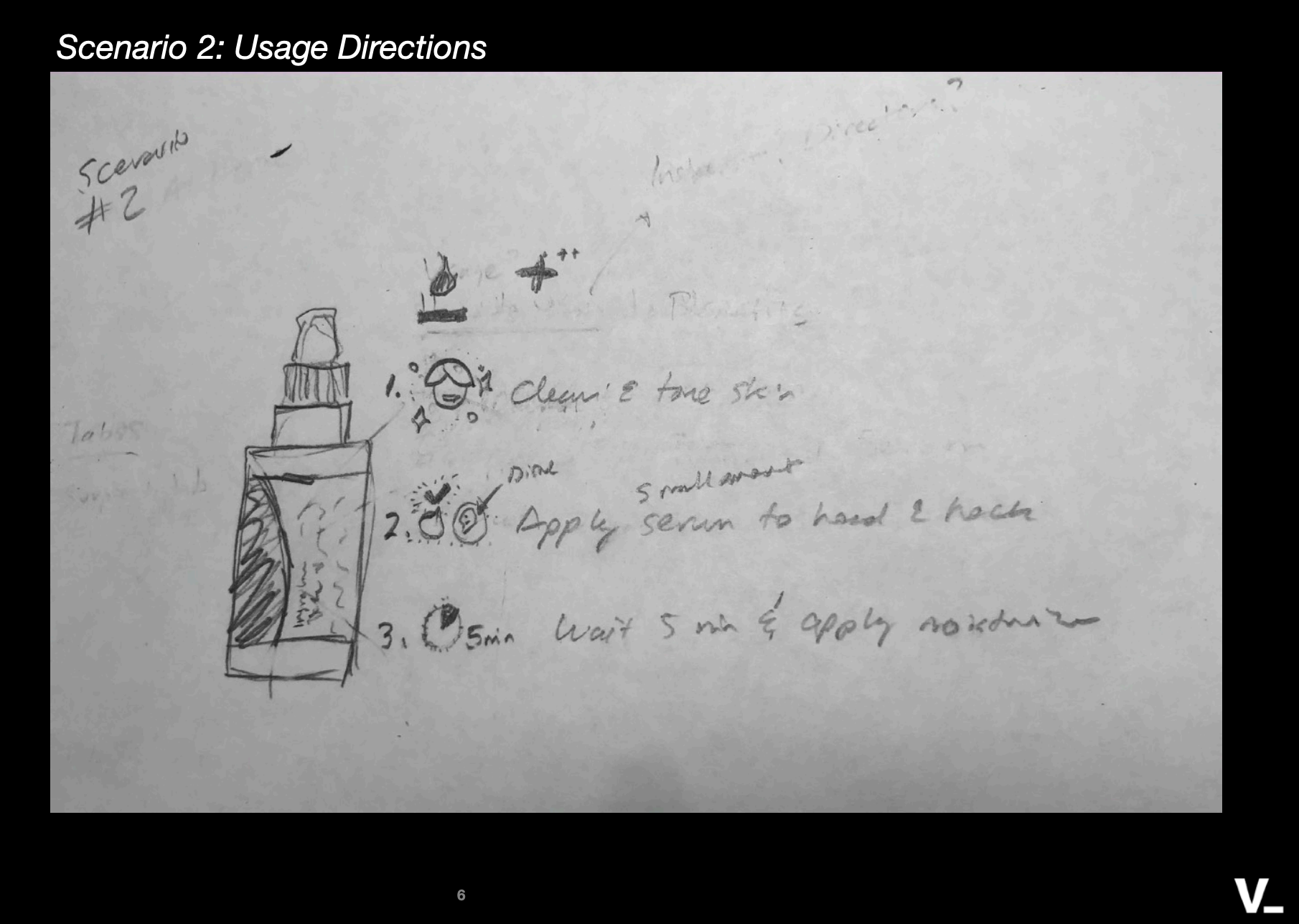
Once home, receive AR onboarding to using this product: things like frequency per day and usage steps.
Here, instead of holding your device (phone or tablet) at a distance from products that are on a shelf, you’re holding the product in one hand and your device in the other hand. Your interactions with the AR display will have to be in the real world, using the product itself as a controller. Think rotating the product, or swiping up and down on the surface of the bottle, to see additional information. Below are early sketches of these interactions.
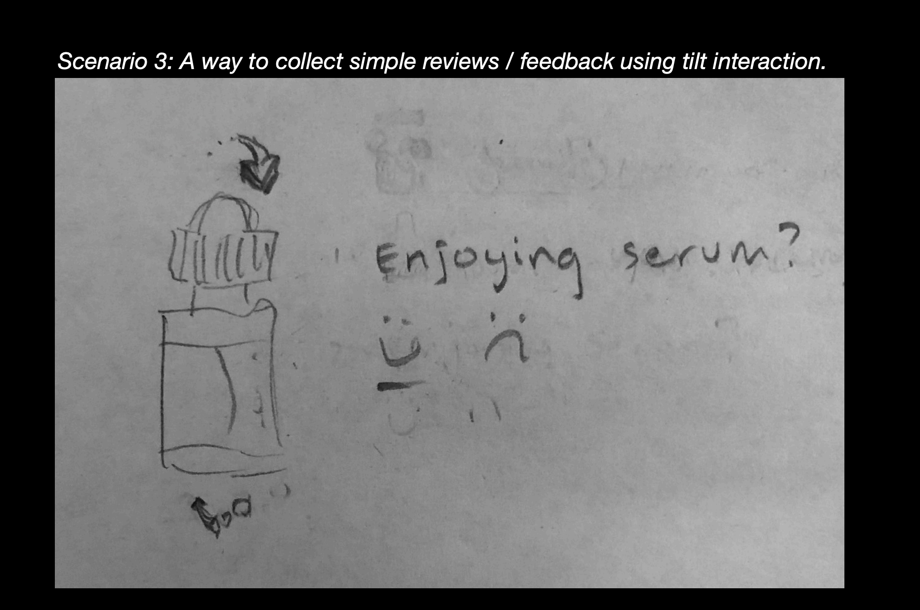
Scenario III: At home, after a while
After you’ve been using the product for a few months, your needs for information will change. You may want to progress to another product concentration or another product in the line; your frequency of use of this product may need to be adjusted. You may also want to leave a review.
To facilitate these needs, the interaction model and visual layout can stay the same, while prioritizing other information in the AR experience itself. In the sketches below you can see a benefit of using the bottle as a controller: this naturally allows for adding “tabs” with additional personalized information and notifications (e.g.: the humidity index in your area is low; use additional moisturizer with this product; or: you’ve been using this product for 3 months, time to think about changing the concentration.)
By focusing on just one product and one product line, from one brand, we are not only narrowing our scope to be able to complete the project in this tight timeline. We are also making it more applicable to an enterprise retail use case for Augmented Reality: one of helping a skincare brand tell their story across several interactions, and eventually, products.
Below, you can see the current mock-up that came from this sketch interaction design process.
Early preview of the real interaction and label
Content Modeling
Identifying and populating the data that needs to be stored and accessed
As the identified scenarios make clear, there is a lot of information that our AR demo will need to access. Some of it will be dynamic, like personalized product recommendations or changing concentrations of the active ingredient over time. Some will be static: brand names, product lines, ingredients. All of this will need to be stored in Contentstack in a manner that makes it both easy to query, and easy to edit or modify. This process is called content modeling, and we will cover it in detail in Week 2.
Development
On the development side, the team also started with some research. Before anything can be built in Augmented Reality, there are a number of parameters that need to be defined. It’s not too different from a website or app project. You need to define language, database, framework, (for us: AR framework and graphics libraries) and any other parameters specific to the project. For us, that meant determining how our AR application will identify the object that’s in front of it, as well as how it will “know” the bottle is being used as a controller.
I. AR Frameworks and Graphics Libraries
Augmented reality development is somewhat of an uncharted territory. While there are a host of SDKs available for developers wanting to build AR experiences, there aren’t all necessarily enterprise-grade, cross-platform, or even production-ready. So the first step for developer Alex Olivier was to do her homework: evaluate the available AR frameworks and graphics libraries to determine which of these would fit our criteria: suitable for a web AR experience (not requiring a native app installation), and as close as we could get to something that a business might actually use to build this kind of application for their own brand.
For the curious: the research is documented here.
The TL;DR is that we chose to go with AR.js (as the best option for building AR for mobile web browsers), Three.js (WebGL framework in JavaScript) and A-frame.js (a framework for Three.js that lets you write HTML-like elements to compose a 3D scene, and also provides a visual 3D inspector.) The next challenge was to get these tools to bend to our will.
Our goal was to be able to track a (serum) bottle’s movement in such a way that our application could determine its position and behave a certain way in response. Or more simply, for the first test case: If the bottle tilts to the right or the left, change something.
II. Spatial coordinates and marker tracking for using the bottle as a controller
AR.js library — Where is the marker?
As the team started working with AR.js midweek, they hit a few road bumps.
Danielle notes, “The biggest challenge with the AR library is ensuring the content appears where we want it to appear, which is the biggest challenge for any AR application!”
They started with Natural Feature Tracking (NFT) in AR.js but noticed issues with the alignment between the image and 3D object overlaid. They then looked into how the coordinate system was set up in AR.js, which led them to discovering another underlying issue around the virtual camera: AR.js likes to position the camera or the marker at the origin of the coordinate system. It has different modes for whether the camera is fixed or in motion, which can affect how it tracks multiple markers.
Essentially, the coordinate system in AR.js is set up to look at objects where either the markers are stationary or the virtual camera is stationary, and has trouble when both are moving around.
Marker tracking and fiducial markers to identify object motion
We tested a couple of different markers to make it easier for AR.js to find the serum bottle. QR codes were especially interesting as these are in common use today. However, ultimately the far better performing markers turned out to be fiducial markers.
Explains Jason, “Fiducial markers are black and white images which look kind of like a QR code but are simpler and have a black square bar around them, and have any kind of rotationally asymmetrical symbol in the middle so the computer can tell which way that square is turned. These have been used in AR for a long time, so there is a lot of solid code around how to deal with them.”
Fiducial marker
Three.js and A-frame to Act When Motion is Detected
As a last step, we tested what happens when we try to tell AR.js to recognize the rotation of the bottle. Under the hood, AR.js leverages the Three.js WebGL framework, and there's another framework called A-Frame (by Google) that can be used with both of them to quickly write HTML-like markups to describe your scene. The team built a custom attribute for A-Frame elements that triggered a rotation event when the bottle is tilted left or right in front of the camera.
… And it worked!
In the video below, you can see that as the bottle is turned, the attribute that we created is looking at the acceleration rate and which way it’s turning, and when it determines that it’s tilted, it switches the image in the middle to blue.
So we’ve got an interaction using the bottle as a controller, which is pretty great!
Next week: learn how we will pull in data from Contentstack to populate the AR interactions, the benefits of a headless system for creating AR experiences, and our path towards building real scenarios and views, using final assets! Read the Week Two Project Spyglass update now.
